Color Personalities + How to Choose Yours

Have you ever wondered why a bride wears white on her wedding day? Or why spas are decorated in cool tones while gyms typically sport bright warm colors? Why do holidays have certain colors attached to them like orange and black for Halloween and pink and red for Valentine’s Day? It all ties back to the idea of color personalities.
Through color, we communicate with each other, sometimes even on a subconscious level. There are emotions, personalities, and actions tied to certain colors, that we may or may not be aware of, that most likely effect our mood on a daily basis. Color can make us feel energized, peaceful, and strong. It can even effect where we choose to buy our coffee from and how productive we are in the office.
If you’re interested in the idea of color personalities and how they affect branding and graphic design, stick around! We’ll discuss what personalities different colors are associated with and how to choose the right colors for your brand.
What are Color Personalities?
Color personalities are the emotions and characteristics that different colors most commonly portray. These are determined through color psychology, which is the study of how the human brain and body react to color. Yes, body. Colors have actually been known to raise or lower your blood pressure, induce sleep, and affect appetite.
There are many aspects to take into consideration when determining how a person may react to different colors. Personal preferences, familial upbringing, regional and cultural background being some examples. For example, yellow is considered happy and uplifting in the United States, but in Egypt it is associated with death and sorrow.
How Does Color Psychology effect Graphic Design?
Every aspect of your branding from the font to the colors evokes a response from your prospective customers, and it’s important that your choices are making the right impression. You want your target audience to have a positive reaction when seeing your brand on signage or social media, and choosing the right color is a part of that.
Your brand should have its own personality, from a general style to a specific voice. The colors used in your graphic design should support this persona. For example, Nike is all about being strong and fearless, so their choice of black as the main brand color supports that, as black evokes a powerful and bold tone.
By taking color personalities into consideration when making graphic design decisions, you’re going one step further to ensure that your prospective customers are viewing your brand in the correct way, therefor gaining their interest and trust much quicker.
Color Personalities & Descriptions

RED
Red is thought to attract more attention than any other color. This is why common symbols involved in emergency situations are red such as exit signs and firetrucks. Red may increase metabolism or raise blood pressure in the body. It is associated with passion in both a negative and positive sense. Positive passion being love and sensuality, with negative being anger or violence.
Color Personality Traits:
Passionate
Determined
Confident
Brand Examples:
Netflix
Target
Coca-Cola
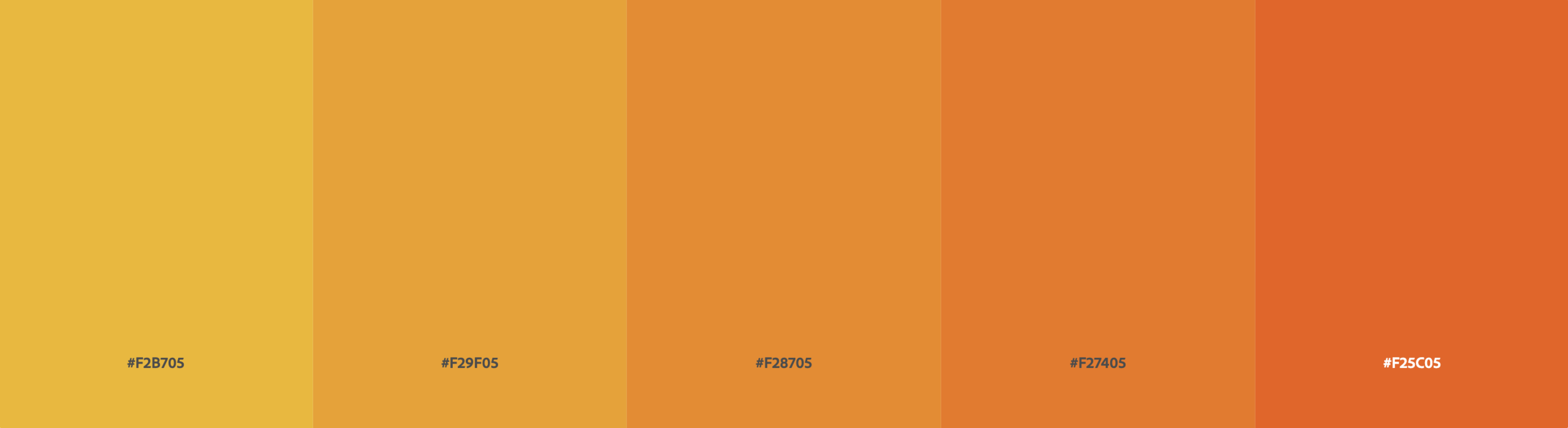
ORANGE
Orange evokes a friendly and welcoming feeling and is often associated with generosity. People should feel free to be themselves when surrounded by the color orange. Orange is commonly used to represent health and vitality as well.
Color Personality Traits:
Energetic
Playful
Friendly
Brand Examples:
Nickelodeon
Fanta
Home Depot
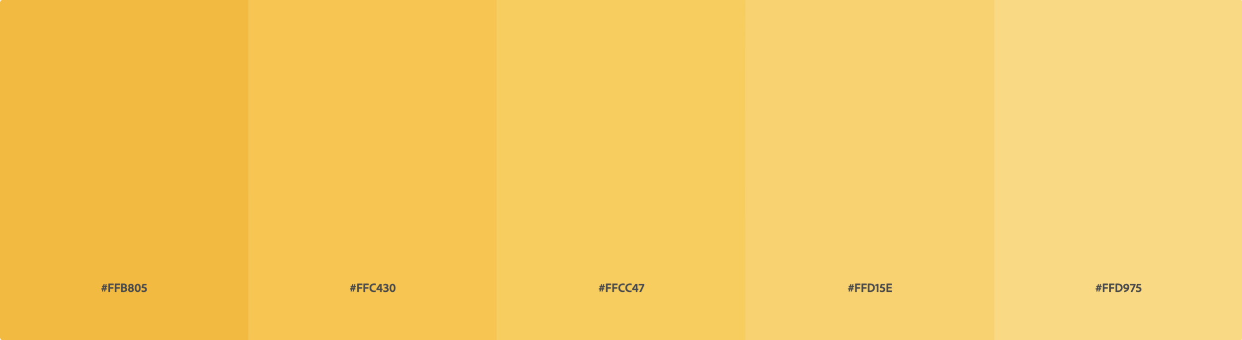
YELLOW
While many people consciously tie yellow to ideas of happiness and cheer, yellow is also connected to intelligence, creativity, and innovation. Yellow has been proven to raise energy levels and enhance mental activity.
Color Personality Traits:
Helpful
Cheerful
Creative
Brand Examples:
McDonalds
Snapchat
Best Buy

GREEN
Green’s strongest connotation is that of nature. Because of this, it’s often used to promote brands that are eco-friendly and encourage growth and harmony. Green also holds a strong connection to money and wealth.
Color Personality Traits:
Soothing
Natural
Wealthy
Brand Examples:
Whole Foods
Animal Planet
Starbucks
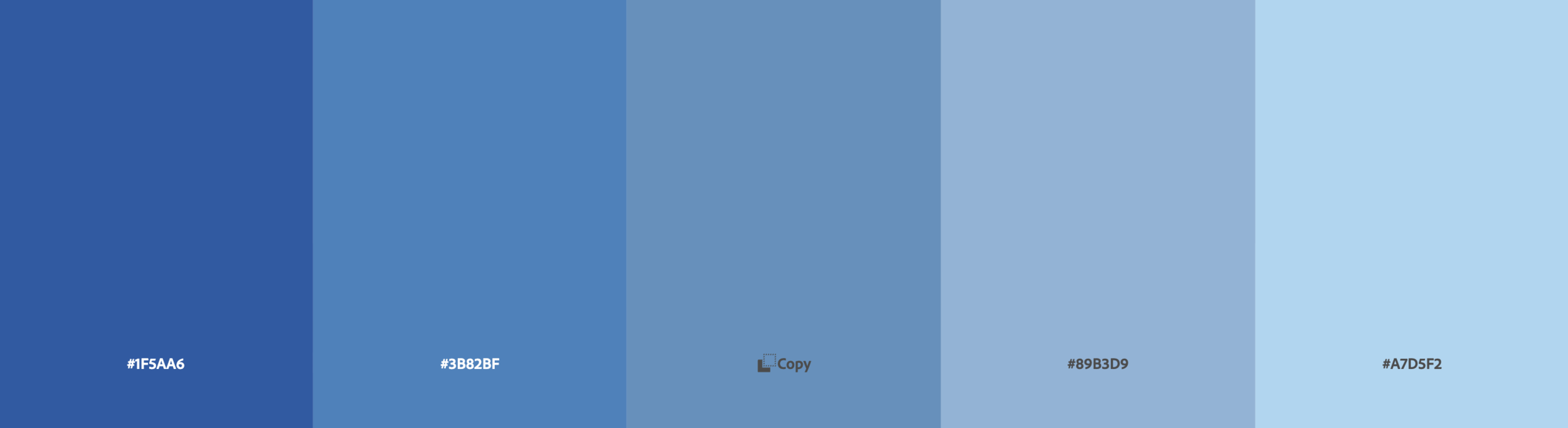
BLUE
Blue is thought to have the opposite effect on the body as red, evoking a feeling of peace and security. It’s also tied with feelings of trust and loyalty, which may be why certain banks use blue as their main color like Chase and American Express.
Color Personality Traits:
Loyal
Trustworthy
Wise
Brand Examples:
Chase Bank
Oral-B
Facebook

PURPLE
Commonly associated with royalty, purple is thought to be a very noble color. However, it also has a gentle supportive vibe, which is why it’s often used for “feel good” brands such as Hallmark and Cadbury.
Color Personality Traits:
Supportive
Charismatic
Gentle
Brand Examples:
Hallmark
Cadbury
FedEx

BLACK
Black is technically not a color, but the absence of color. This sets it apart from other colors, giving it a more exclusive and sophisticated tone. While black is known to represent mourning in Western culture, it also suggests strength and power. Black is most often used to represent either high-end designer or athletic brands.
Color Personality Traits:
Sophisticated
Mysterious
Strong
Brand Examples:
Prada
Sony
Adidas

WHITE
White is a universal symbol of purity and hope. It represents a blank canvas with endless opportunities in front of it. White is often used for brands that promote health and vitality such as skincare and medical brands.
Color Personality Traits:
Clean
Hopeful
Simple
Brand Examples:
Olay
Apple
L’Oréal
How to Choose your Brand’s Colors
Now that you understand the basic psychology behind color personalities, how do you choose which is best for your brand? Follow these simple tips when deciding your business’s brand color.
Target Audience
Who is your target audience and what do you want them to think of your brand? For example, if your target audience is young professionals on a budget, you may not want to use a color like black that evokes exclusivity or sophistication because they may assume your products will be out of their price range. How do you want your brand to make your target audience feel?
Location
As we mentioned, different regions and cultures have different color meanings and traditions. Are you a global brand or tied to a specific location? If you are global, steer clear of colors with vastly different meanings across different regions or be willing to adjust your branding based on where you’re marketing to.
Competitors
Research your competitors and see what brand colors they chose. You can take inspiration from them but remember you don’t want to copy. If your brands are too similar yours won’t stand out in people’s minds.
Brand Purpose
Does your brand’s purpose lean towards a particular color personality? For example, if you’re all about sustainability you may want to use green in your brand colors. Maybe you’re promoting body positivity and acceptance. Orange could be the color for you!
Final Thoughts
Using color psychology when deciding your graphic design colors can give you a major advantage in building an impactful and reputable brand. Have more graphic design questions? Contact us today!